MGP wanted a statement of pride, premium vodka without any bling or embellishments. Newbreed developed the verbal and visual strategy for TILL VODKA, MGP's first every proprietary brand. An idea that is rooted in the American spirit and very much Kansas. #TILLTOMORROW
Service
Naming, Branding Strategy, Logo and Packaging Design
Client
MGP
Year
2015


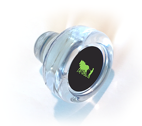
The packaging and brand identity required a modern look of rural aesthetics. We naturally began exploring tilling iconography, playfully positioned our guy RETRO grade to the normal, tilling against the grain is what it's all about. We declare that taming the land and our future is an icon of America’s desire for innovation and better vodka.
Where you come from says a lot about you,
and the same is true about your design...
From this strategy we developed the TILL branding and bottle design. Building a brand on integrity not luxury, truth not magic. The clean lines and pride of freshly tilled cropland was the inspiration for the design - the wood-cut look it gave an edge as well as creating a cool effect when wrapping around the bottle .

BRAND CONSISTENCY MATTERS:
FROM DISTILLERY VISITOR CENTER to POS
We extend the design look and voice to create an immersive brand experience at the TILL visitor center and KC ALL-STARS Lounge. The design delivers on the brand’s heartland values - the pride of the hard working Kansas farmers that grow and harvest the wheat that is in every bottle of Till..
#TillTomorrow Social Movement
To engage our consumers, we started a cultural movement they'd want to be a part of. Interviews in select launch cities about what locals loved about their cities and why.
We also ask what they would change, exposing compassion and pride.
The strategy was to energize local pride centers and make a change.


